Enhanced Data Visualization with the Autochart Tool
Shared, Intuitive Charting
As part of our ongoing commitment to providing tools for an efficient research workflow, Flywheel offers an Autochart Tool through the User Interface (UI) Extension API. This UI component allows researchers to chart tabular data in Flywheel to streamline visual inspection and verify Gear outputs without leaving the platform. Chart views include line charts, scatter plots, and bar graphs.
The chart views are easily customizable. Users may choose the data orientation, write chart and axis titles, and change how data labels display. Flywheel saves the latest chart configuration for all users on a given data set, allowing teams to set the most appropriate view for all future use. Charts may also be downloaded for easy sharing during data validation.
View Data and Metadata Before Running Analyses
Flywheel offers several methods to visually inspect data in Flywheel before running analyses, including in the OHIF viewer and Data Views. With the addition of the Autochart Tool, scientists can assess statistical properties without downloading data. Use cases include:
- Charting demographic data of subjects
- Viewing change over time in longitudinal data
- Summarizing form results
Inspect Analytical Results
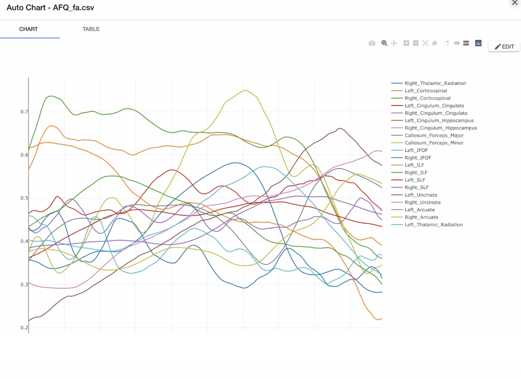
The Autochart Tool can also display the results of Gears. In the example below, fractional anisotropy results (an index of white matter integrity) are charted for fiber tracts in the brain.

Displaying AFQ Gear outputs in Flywheel with the Autochart tool.
To add the Autochart Tool to your Flywheel instance, follow the instructions in the Flywheel Extension SDK.